HIGHER CALLING
Higher Calling is about a cloister of nuns who embark on their annual pilgrimage in the mountains. Ruth, a recent joinee, follows the peculiar group up the perilous path. Signs of an incoming storm keep piling on, but her fellow sisters don't seem to take notice, a decision which might just lead them to their demise.
Beyond co-directing with Adèle Fisch, I, as Art Director, crafted the film's visual identity (characters & backgrounds), oversaw production, and contributed to the animation of the characters, bringing the story to life.
GENRE
Comedy and Tragedy
LENGTH
7 min
TARGET AUDIENCE
Family
ANIMATION TECHNIQUE
2D computer, frame-by-frame animation
CHARACTER DESIGN
Higher Calling's characters utilize a stylized cartoon aesthetic. Simplified shapes portray distinct personalities and enhance animation for smooth, expressive movement. This stylistic choice is particularly evident in the senior nuns, contrasting with the protagonist Ruth's grounded design.
MEET THE CHARACTERS

Ruth

Bridget

Gertrude

Sister Martin
Ruth
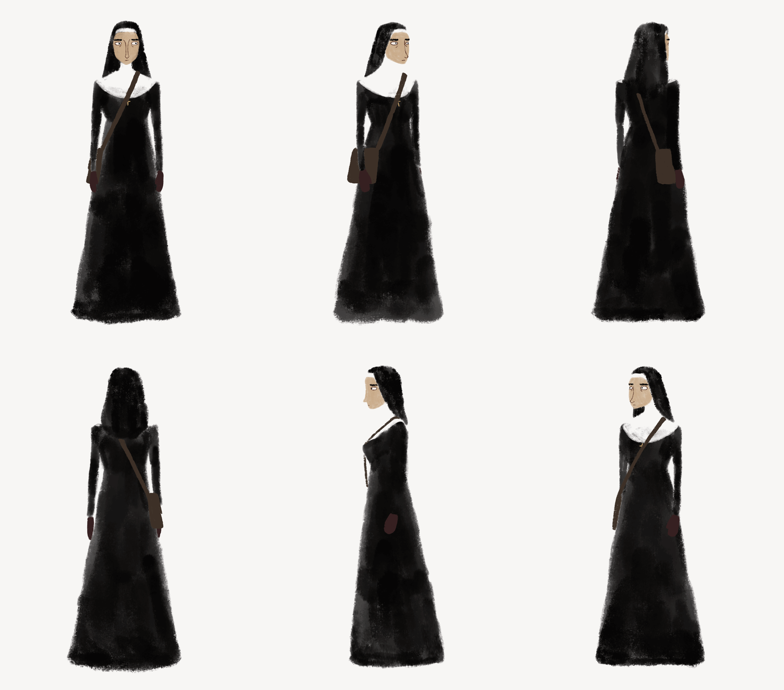
Ruth, a newcomer to the convent in her 30s, has chosen to reorient her life in search of a community that aligns with her beliefs.
DESIGN CHOICES
Ruth stands out visually from the other nuns. Her design reflects her background and internal struggles.
-
Realistic proportions: Identify her as the protagonist and create a contrast to the rest of the convent.
-
Resolute features: Strong jaw, upright posture, and thick eyebrows convey determination.
-
Partially hidden cross: Symbolizes the interplay of her scientific background (the bag holding her binoculars) and her evolving faith.
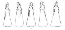
Earlier Designs:

Bridget
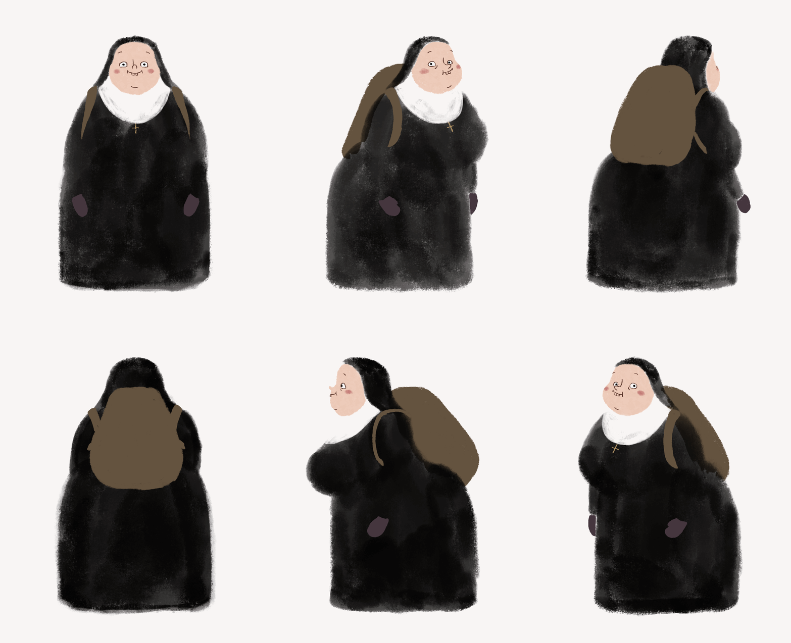
A bubbly and enthusiastic German nun in her 60s, Bridget embodies unwavering faith and naivety. Unlike the newcomer Ruth, she embraces the traditions and annual pilgrimage with childlike glee.
DESIGN CHOICES
-
Soft and rounded shapes: Creates an approachable and friendly visual impression.
-
Rosy cheeks and small facial features: Contributes to a youthful and playful appearance, reflecting her naivety and unwavering optimism.

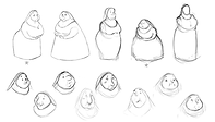
Earlier Designs:
.png)
Gertrude
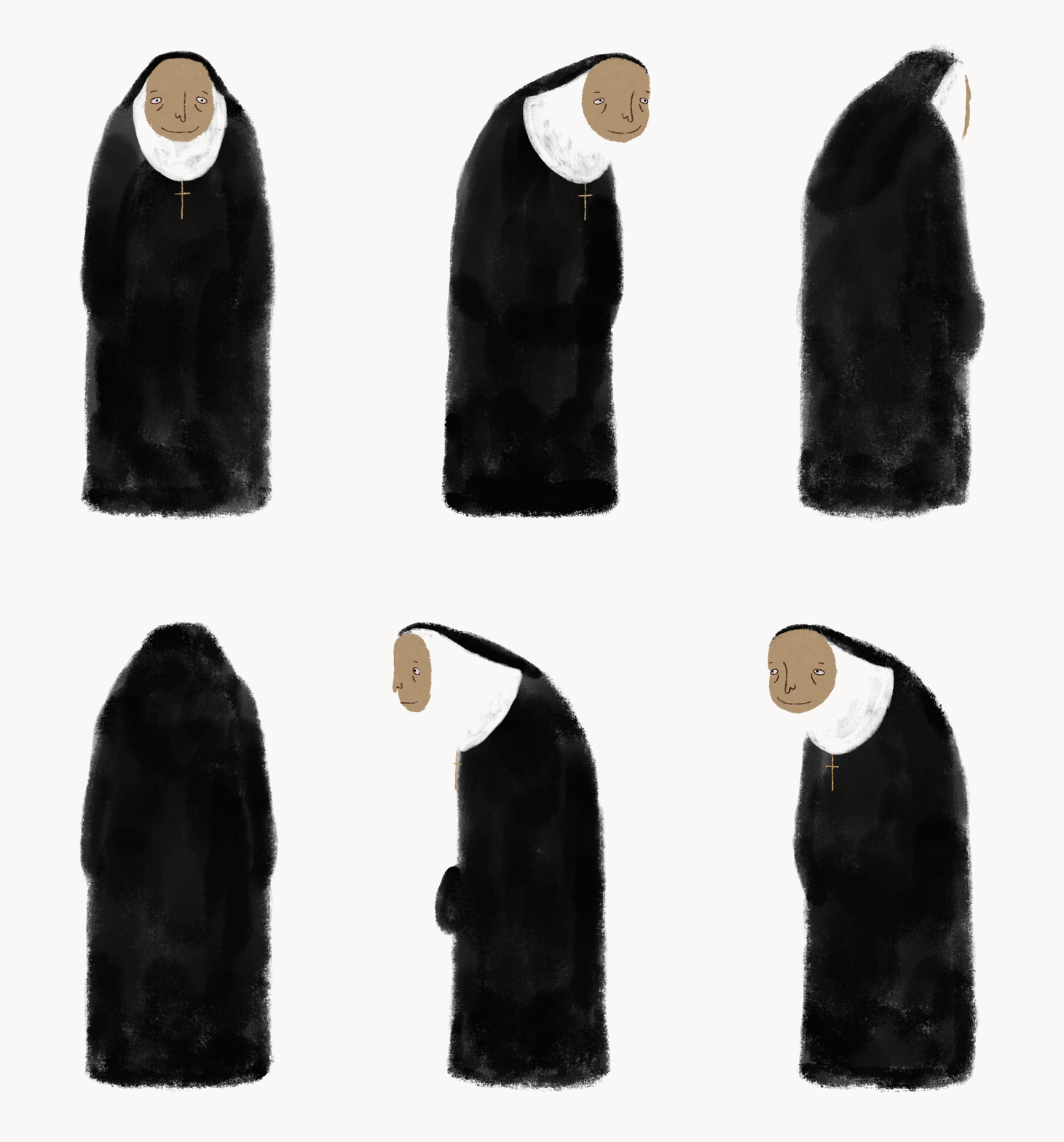
An 80-year-old devout woman, bound by a long vow of silence, Gertrude speaks in barely audible whispers, even her own voice a stranger after years of quiet.
DESIGN CHOICES
-
Age & Wisdom: With a long neck and a slightly hunched posture, her design hints at her age and off-set personality.
-
Unified shape: The fully cloaked figure and hidden hands contribute to the sense of obscurity surrounding her character.
.png)
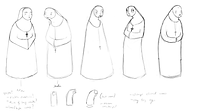
Earlier Designs:
.png)
Sister Martin
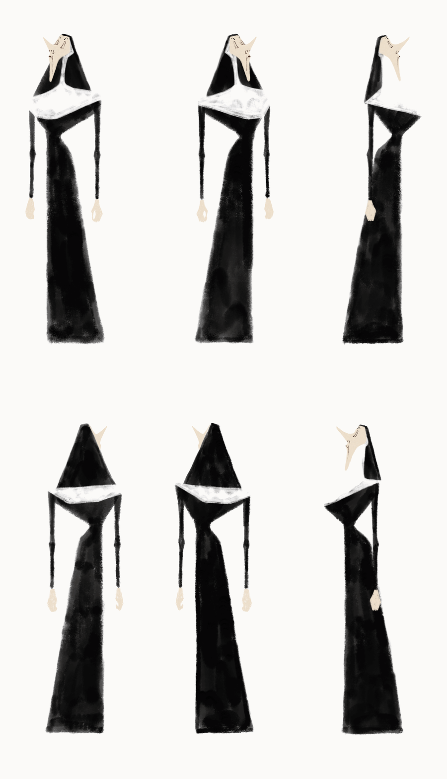
The head of the convent, Sister Martin, is a French woman in her 60s who commands respect with her authoritative presence.
DESIGN CHOICES
-
Geometric shapes: With sharp angles and triangles Martin's design visually represents her unwavering convictions and strong will.
-
Upright posture and pointed nose: Emphasizes her leadership role, conveying a sense of authority and decisiveness.
Earlier Designs:
.png)

THE VISUAL IDENTITY
Higher Calling's visuals serve as a guide through Ruth's tumultuous journey – a quest for faith and ultimately, self-discovery.


The Storyboard
Adèle Fisch's storyboard captures the narrative's visual progression. In the panels to the left the brewing storm is introduced, setting the stage for the escalating tension to come.
Storyboard by Adèle Fisch
THE COLOR SCRIPT
A Journey Through Light
The colorscript starts hopeful with a sunrise, symbolizing the journey's dawn. As tensions rise, the palette darkens with ominous clouds and shadows. During the peak storm, a whiteout signifies danger and disorientation. Finally, light breaking through the mist signifies both survival and newfound clarity for Ruth.


THE MAKING OF
The Process of Finding a Visual Identity


Simple & Graphical
-
Broad experimentation
-
Playing with a minimalist style with muted colors and whites
-
While it conveys the intensity of the storm, the approach lacks visual depth and limits the ability to translate the narrative through design
Color & Light


-
Exploration of the sky and its interaction with the snow
-
Using light and vibrant colors to create contrast

.png)
.png)
Simplified Color Evolution
-
Pushing the vibrancy and contrast of the colors and values
-
Creates depth and communicates the vastness of the mountains
The Final Identitiy


The final visuals combine a textured approach with organized color. Balanced values allow for dramatic shifts in the climax. The black & white nuns stand out against vibrant backgrounds, creating a stark contrast. Subtle black accents in the background (trees, snow) tie the nuns visually to their environment.
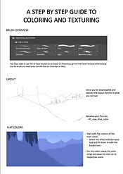
From Thumbnail to Final Design




Ensuring Consistency
Collaboration with other background artists boosted production, but maintaining a cohesive visual style was crucial. To achieve this, I created a style guide and utilized a curated set of textured brushes.
DIVINE LIGHT
Nature
&


Church


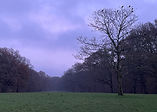
Light plays a pivotal role in Higher Calling, drawing inspiration from both the natural world and the symbolism of Christian art. Medieval iconography subtly influences the film's visual language, particularly in the use of light, imbuing key moments with deeper meaning.
pen_spark
LIGHT EXPLORATION
I explored various styles, from naturalistic to textured and graphical approaches:


While graphical approaches offered a clear image of divinity, similar to the gold ground found in medieval art, I ultimately decided on a more detailed and nuanced sky. This allowed for a more deliberate placement of light rays, influencing how the environment interacts with the characters and reflecting Ruth‘s emotional journey.
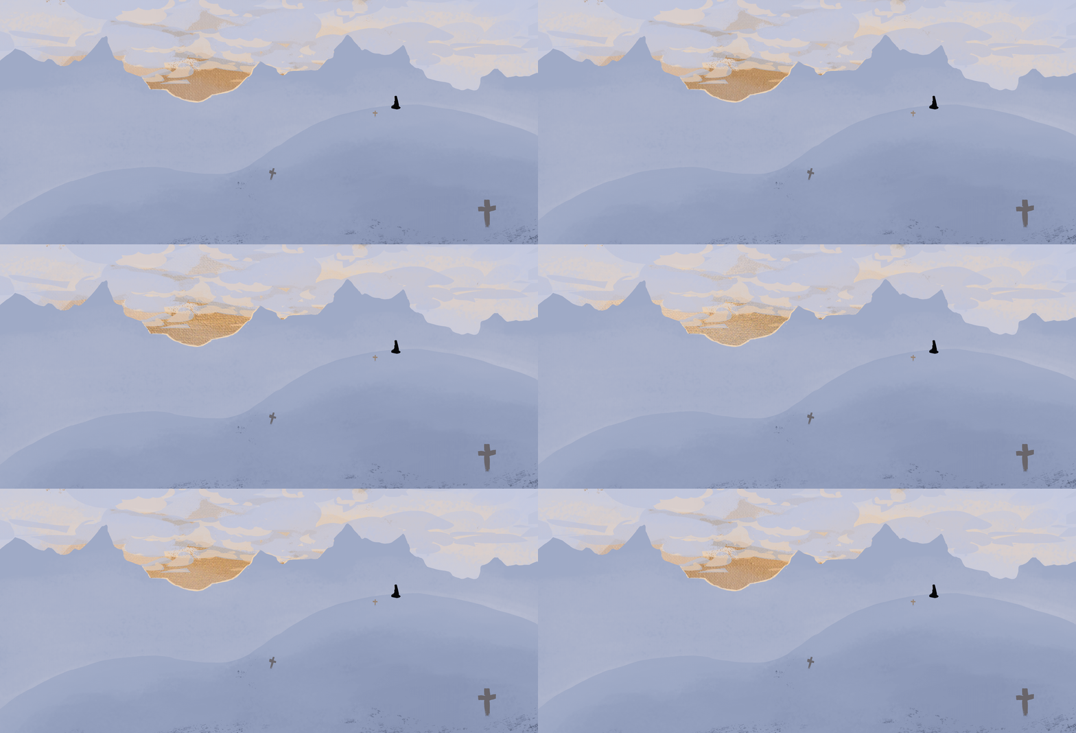
Additional experimental exploration with gold paint:

ANIMATION
Animation plays a crucial role in bringing personalities to life:
Ruth
-
Naturalistic movements
-
Setting her apart as the protagonist navigating an unfamiliar world
Bridget
-
Smooth and bouncy animation, a more cartoony style
-
Emphasizing her cheerfulness and optimism
Gertrude
-
Slow and minimal movements
-
Hinting at her advanced age and wisdom
Sister Martin
-
Harsh, rapid movements, reminiscent of cut-out animation
-
Capturing her authoritative and decisive nature
HIGHER CALLING & BEYOND
TARGET COMPLETION DATE
December 2024
CURRENT COMPLETION STATUS
40 %
In my work, I like to highlight the humanness of people in walks of life that are usually phenomenalized and reduced to stereotypes. Like nuns living in a convent. In my graduation project, we were able to explore their emotions and individual struggles by addressing questions regarding blind faith, tradition, societal change, and the fear of progress. It asks the dilemma: where does devotion cross the line into fanaticism?
I am fascinated by how characters adapt to changing environments and navigate group dynamics. This is something I like to set a particular focus on in Character Design, and how these characters interact.
A big thank you to all of our collaborators and those who offered invaluable guidance & support!
Credits:
Script & Storyboard: Adèle Fisch
Art Direction: Carlotta Steckner
Score: Celeste Wright
Voice Acting: Marysvoices & Petra Hoffmann
Animation: Adèle Fisch, Carlotta Steckner, Leon Loś, Emma Brittmann, Aitana Montalvo Cabornero, Yelyzaveta Lidova, Casper Decraene & Lorana Korolkova
Backgrounds: Carlotta Steckner, Andrea Lugo Olvera, Leonie van den Berg & Kelly Ngan
Special Thanks To:
Cesare Davolio
Robert-Jonathan Koeyers
Daan Faudet
Arif Abdillah
Thomas Rietbergen
Noémie Le Coq
